Jaguar's New Direction with a Bold Logo Redesign
In an ambitious move to redefine itself, Jaguar has launched a new logo and brand identity focused on its transformation into a fully electric vehicle manufacturer. Embracing a modernist aesthetic, the redesign includes a clean and minimalistic logo, termed the 'Device Mark.' The updated logo features a unique blend of uppercase and lowercase letters, showcasing a fresh and contemporary style.
This rebranding is part of Jaguar's broader strategy to establish itself as a dominant player in the luxury electric vehicle (EV) sector, targeting high-end competition such as Rolls-Royce and Bentley. The revised brand identity includes several novel elements like the 'Strikethrough' graphic motif and a set of 'Exuberant Colors,' all intended to convey a sense of luxury and forward-thinking design.
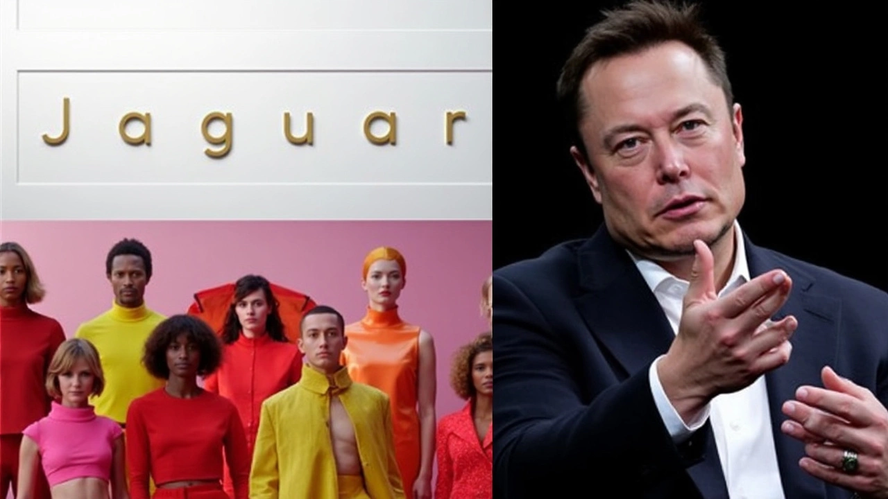
Elon Musk's Comments Stir Online Buzz
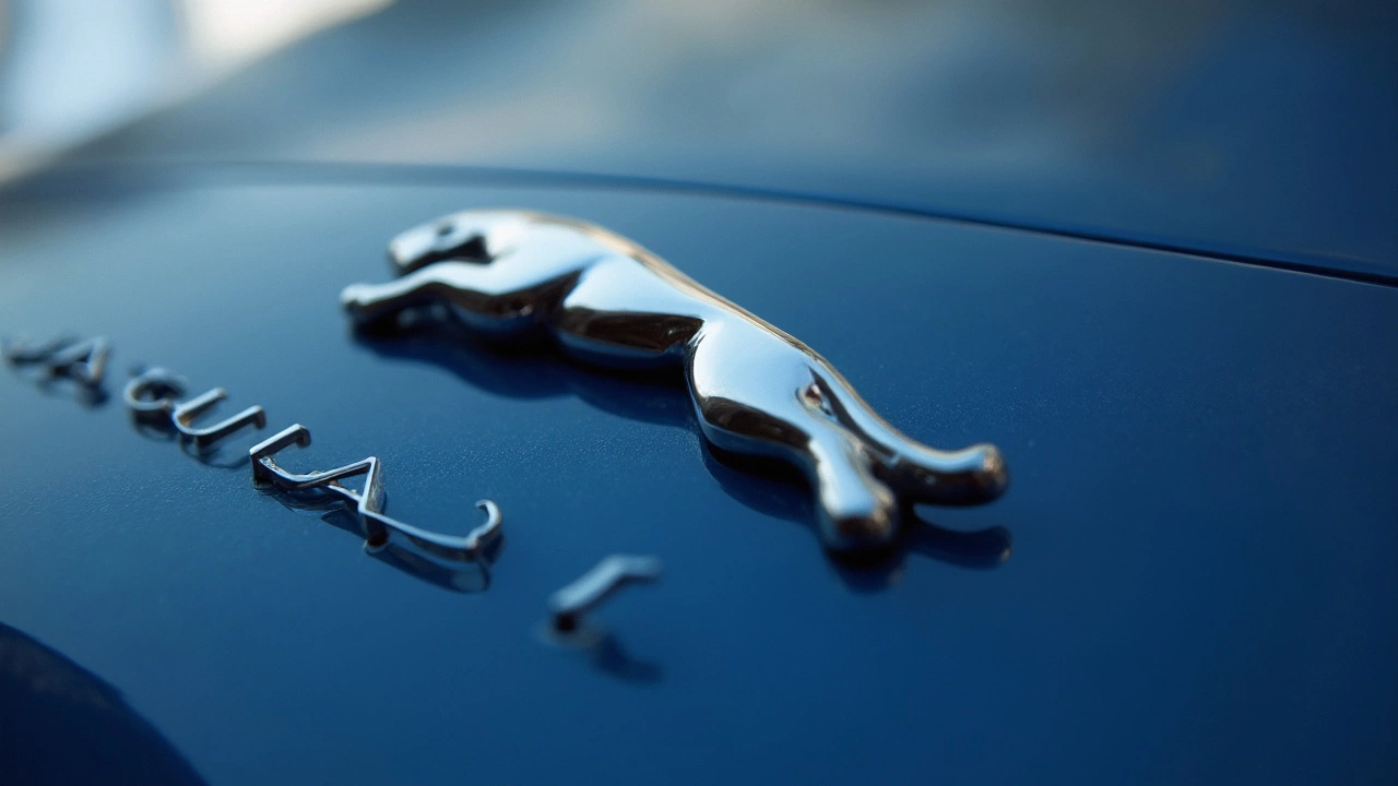
The shift toward an all-electric lineup includes plans to roll out three production EVs by 2030. Pioneer of this new era is a luxury electric sedan, a vision previewed by Jaguar Design Vision Concept. The commitment to blending tradition with innovation is evident as the iconic leaper mascot remains, now complemented by a new, elegant monogram.
However, the redesign hasn't come without its critics. Tech mogul Elon Musk took to social media to mock the new logo, sparking a flurry of online banter. Demonstrating their confidence, Jaguar responded with a witty comeback, defending their bold design and emphasizing the strategic shift they aim to achieve through it.
This exchange has shined a spotlight on Jaguar's new branding, stirring debates and dialogues in both the automotive and tech communities. While Musk's criticism may be biting, it underscores the significance of Jaguar's transition to a luxury EV pioneer. With their eyes set firmly on an electrified future, the carmaker is paving a new path, one that might turn heads and stir conversations, exactly what any groundbreaking rebranding hopes to accomplish.